Symbols of the Region
The Logotype of the Olomouc Region
The logotype is characterized by five-pointed flower which represents a symbol of friendship, love and respect. The leaves correspond to five districts of the Olomouc Region, they also present the basic aspects of the life in the region such as the environment and natural richness, developed industry, education, history and tradition.
The logotype of the Olomouc Region is protected by the Czech Law, use the logo only with the permission of the Olomouc Region. For more information contact the Department of International Relations of the Olomouc Region. The Head of the Department is Jitka Brabcova (j.brabcova@kr-olomoucky.cz, 00420 585 508 830).
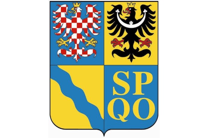
The Coat of Arms of the Olomouc Region
First quarter of the square shield - on a blue background, a silver-red chequered she-eagle with golden armour and a golden crow, represents Moravia.
Second quarter of the square shield - on a yellow background, a silver-black she-eagle with golden crow, represents the fact that the very Northern part of the Olomouc Region belonged historically to Silesia.
Third quarter of the square shield - on a yellow background which represents fields of corn of the region Haná and agricultural flat land of Silesian Haná region, there is a blue stripe of the river Morava.
Last quarter of the square shield - letters SPQO represent the Latin words "Senatus populus que Olomucensis" that mean the Senate and the folks of Olomouc.


